SERIAL COOKIES
Packaging, Branding, Logo Design, Illustration | Instructor: Nathan Young | Illustrator, Stager, Photoshop
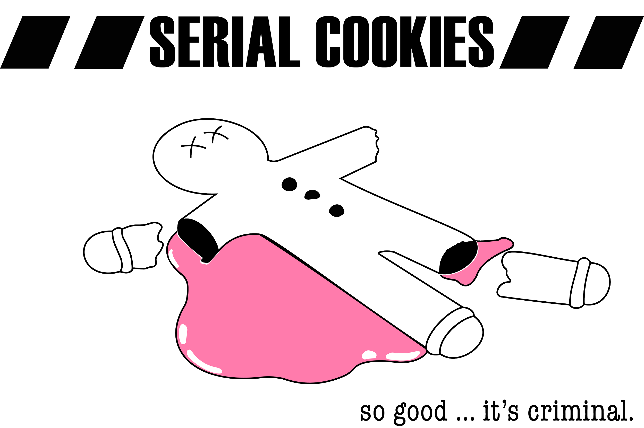
Think of rhyming pairs in your head, and what some of these might look like as images. ‘Cool Ghoul’ could be a cool ghost on a skateboard. ‘Fat Cat’ could be a cat on the couch unwilling to move. The possibilities are endless. For mine, I went with ‘Dead Gingerbread’. I got inspired by cop shows and how they have crime scenes set up.
"Serial Cookies" is a unique cookie brand with a whimsical take on crime scene investigations.
Original

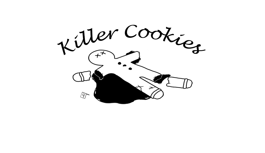
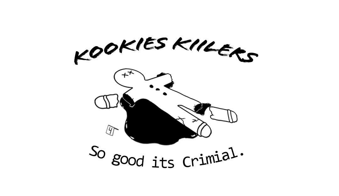
The idea began with the concept of 'Dead Gingerbread,' envisioned from popular rhyming pairs and dramatized in a humorous, crime-themed narrative. This led to the creation of an original image that humorously portrays a gingerbread man at a crime scene, setting the tone for the entire brand.
Rough Drafts


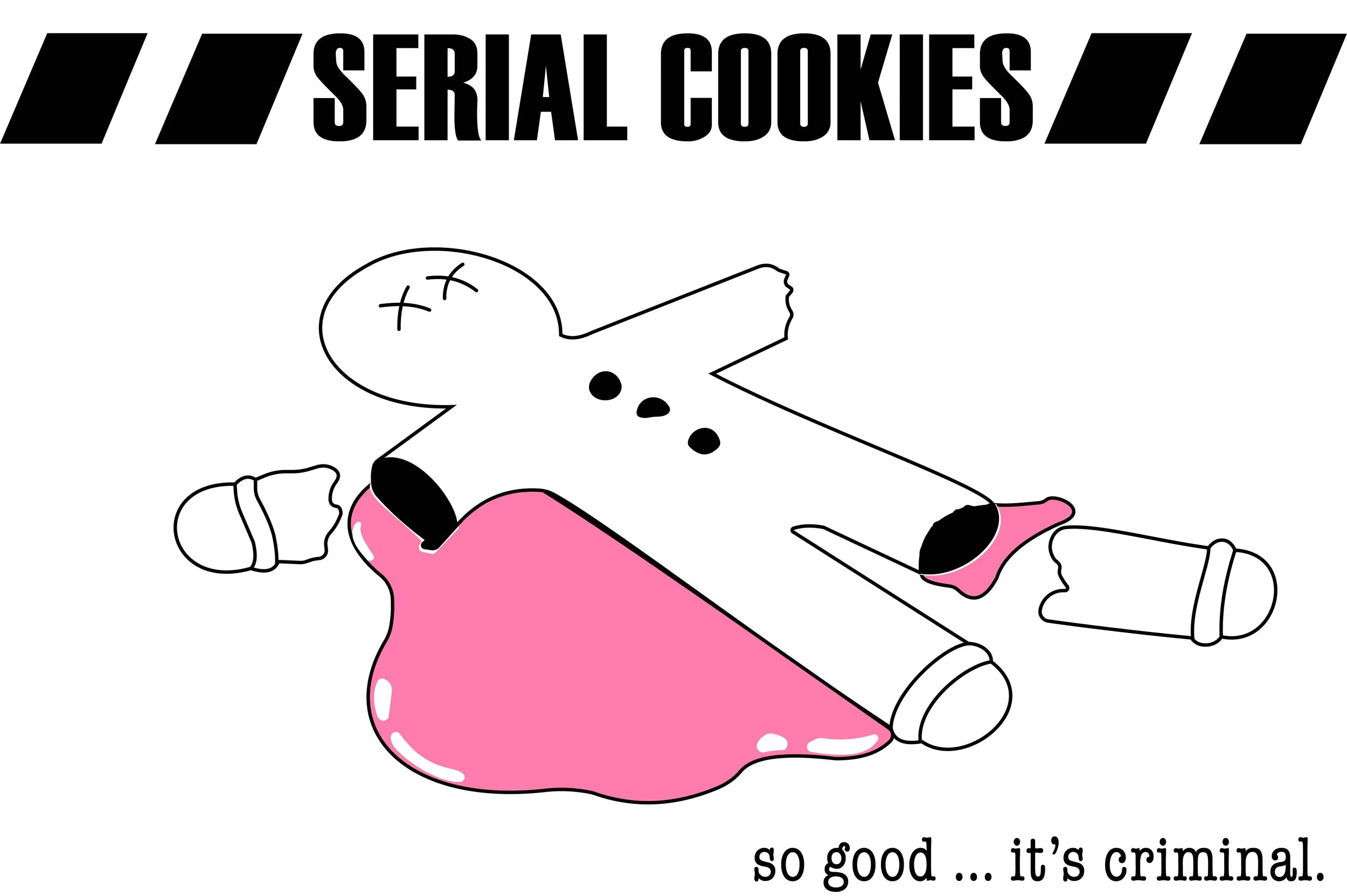
Logo Finish
Initial sketches focused on capturing the essence of the theme with potential brand names and taglines, exploring various iterations before settling on "Serial Cookies" with the tagline "so good…it’s criminal." The design process involved refining the brand's visual identity, focusing on a logo that would effectively communicate the brand’s playful yet mysterious quality.
The decision to simplify the logo, removing additional characters to emphasize the main gingerbread man with strategic color choices like pink for icing, enhanced the brand's connection to cookies while maintaining a link to the crime scene theme.
Rough Rendering
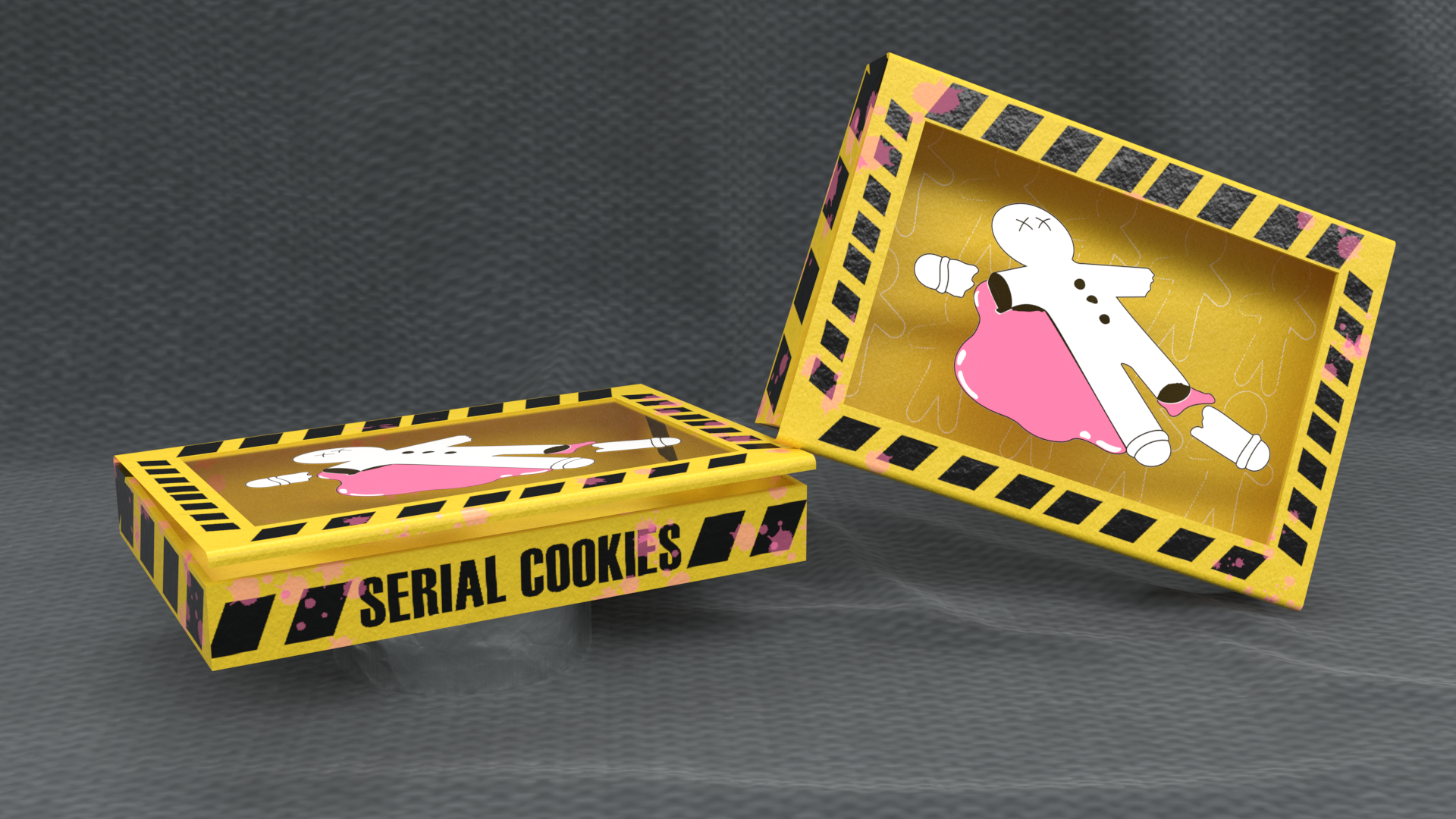
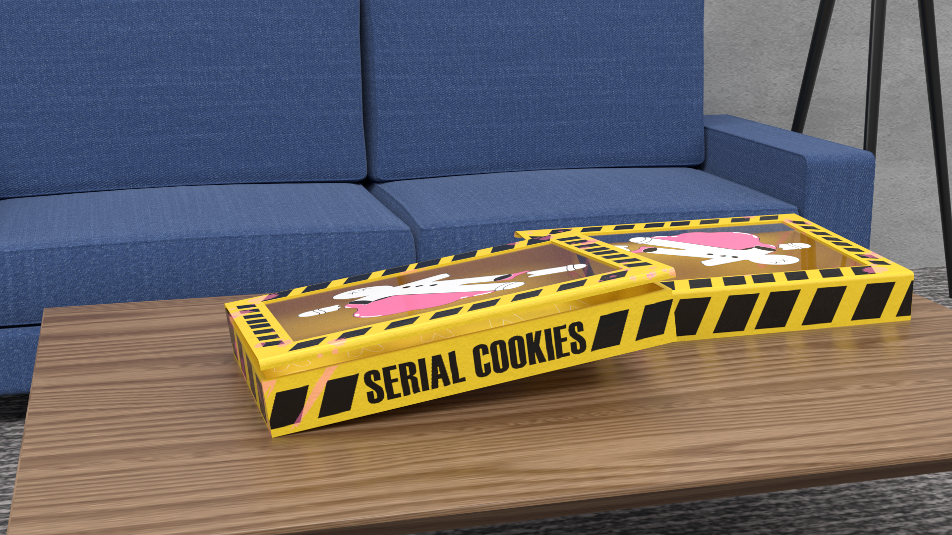
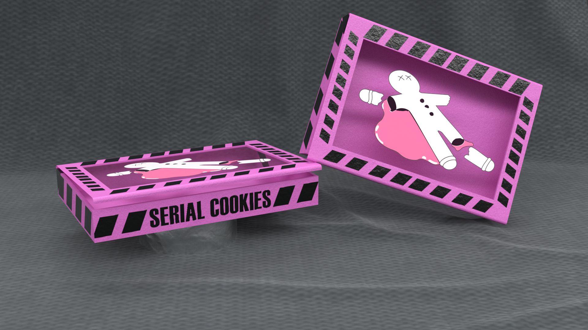
The packaging design began with a clear-topped box to showcase the cookies, incorporating police tape elements to strengthen the crime scene narrative. The choice of pink initially mirrored typical sweet treat packaging but was later adjusted to yellow to better align with the police tape concept. This shift was complemented by pink "blood splashes" and chalk outlines inside the box, adding layers of discovery and interaction for the consumer.
FINALS
The box's exterior was finalized in yellow with thematic pink splashes and a creative inside design featuring chalk outlines, visible after the cookies were consumed. Complementary business cards in pink were designed to contrast with the yellow packaging, ensuring a cohesive and striking brand presentation.
"Serial Cookies" successfully marries a playful concept with design execution, resulting in a distinctive brand that stands out on the shelf.